Create 3 informative visualizations about malaria using Python in a Jupyter notebook. Where appropriate, make the visualizations interactive.
Solution:
The Malaria Dataset comes from a Data Challenge held by the Wellcome Trust and Sage Bionetworks, which was hosted in 2018. This dataset includes 3 subdatasets containing information of malaria incidence, overall deaths rates of all ages and death rates in different age groups across different countries and time all over the world.
Here I used the Python packages pandas to preprare the datasets and bokeh to create interative figures decribing the malaria conditions in Asian countries in the recent years. bokeh is a widely used open-source library to create interactive and shareable figures. It comes with a powerful toolbos which allows moving, zooming, reseting and saving the figures.

if bokeh is not installed, we need to first install it using the following code:
! python3 -m pip install --quiet bokehAfter the installation, we need first to import required libraries and read in the datasets using pandas. I also recommend a 21-color palette to display a large dataset. In the following figures, we need a relationship table mapping coutries to their continents.
#read in the data and import required modules
import pandas as pd
from bokeh.plotting import figure, show, output_notebook

country_continent_code_url = ("https://pkgstore.datahub.io/JohnSnowLabs/country-and-continent-codes-list/"
                              "country-and-continent-codes-list-csv_csv/data/b7876b7f496677669644f3d1069d3121/"
                              "country-and-continent-codes-list-csv_csv.csv")
country_continent_code = pd.read_csv(country_continent_code_url)
country_continent_code = country_continent_code[["Continent_Name","Three_Letter_Country_Code"]]
country_continent_code.rename(columns={"Three_Letter_Country_Code": "Code"}, inplace=True)

tol21rainbow = ("#771155", "#AA4488", "#CC99BB", "#114477", "#4477AA", "#77AADD",
                "#117777", "#44AAAA", "#77CCCC", "#117744", "#44AA77", "#88CCAA",
                "#777711", "#AAAA44", "#DDDD77", "#774411", "#AA7744", "#DDAA77",
                "#771122", "#AA4455", "#DD7788")

data_death = pd.read_csv("https://raw.githubusercontent.com/rfordatascience/tidytuesday/master/data/2018/2018-11-13/malaria_deaths.csv")
data_age = pd.read_csv("https://raw.githubusercontent.com/rfordatascience/tidytuesday/master/data/2018/2018-11-13/malaria_deaths_age.csv")
data_incidence = pd.read_csv("https://raw.githubusercontent.com/rfordatascience/tidytuesday/master/data/2018/2018-11-13/malaria_inc.csv")
We then prepare our datasets for the data visualization. To achieve our aim, we first need to explore the dataset using pandas.DataFrame.head() function; thereafter, we need to merge information from malaria datasets with country-continent mapping table.
#to show the first several rows
data_death.head()
country_continent_code.head()
#drop those without a country code (or assigned to "Global"?)
data_death = data_death[~(data_death["Code"].isna())]
#add continent information
data_death = data_death.merge(right = country_continent_code, how ='left',
                              left_on = "Code", right_on = "Code")
data_death.head()
#the last column name is tooooooooooo long, I change the name
data_death.rename(columns={"Deaths - Malaria - Sex: Both - Age: Age-standardized (Rate) (per 100,000 people)": "Death_rate"},
                 inplace=True)
data_death.head()
Finally, we will get a table like the follwing:
.png)
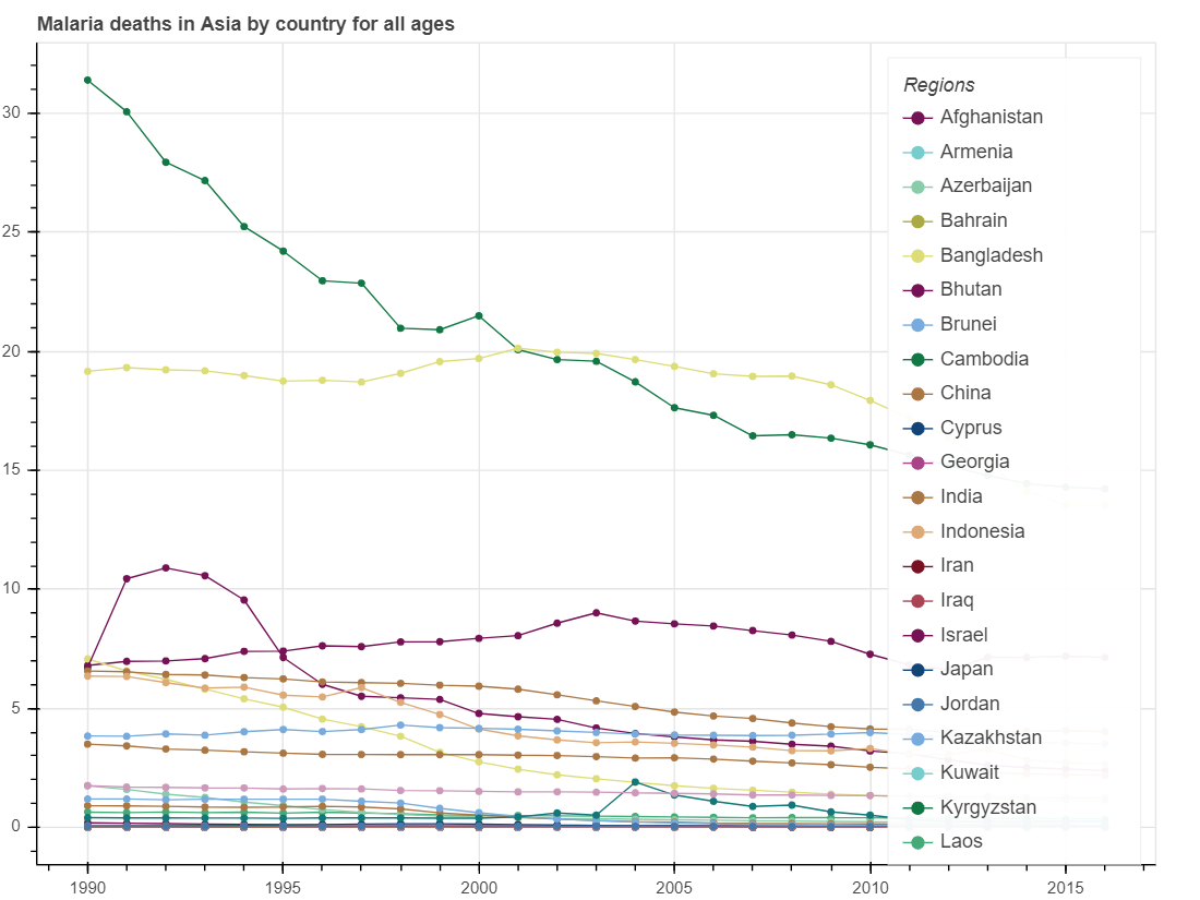
After the data preparation, we begin to visualize these dateset. In bokeh, we will firstly direct the output to Jupyter notebook, create a canvas and then add lines and points on that canvas. An code example can be:
#data_death visualization
output_notebook()
p_death = figure(title="Malaria deaths in Asia by country for all ages", width=800, height=600)

#we need to render each country each time
entities = data_death.Entity.unique()
continent = data_death.Continent_Name.unique()
for i in range(0, len(entities)):
    data_death_temp = data_death[(data_death["Entity"] == entities[i]) & (data_death["Continent_Name"] == "Asia")]
    if len(data_death_temp) == 0: continue
    p_death.circle(data_death_temp["Year"], data_death_temp["Death_rate"],
                   color = tol21rainbow[(i % 21)], legend_label = entities[i])
    p_death.line(data_death_temp["Year"], data_death_temp["Death_rate"],
                 color = tol21rainbow[(i % 21)], legend_label = entities[i])

p_death.legend.title = 'Regions'
show(p_death)
And we got the figure describing the decreasing death rates in the Asian countries in the past several decades.
In similar procedures including data preparation and visualization, we can plot the three datasets subsequently:
#to show the first several rows
data_age.head()
#drop those without a country code (or assigned to "Global"?)
data_age = data_age[~(data_age["code"].isna())]
#add continent information
data_age = data_age.merge(right = country_continent_code, how ='left',
                          left_on = "code", right_on = "Code")
data_age.head()

#data_age visualization
output_notebook()

p_age = figure(title="Malaria deaths under 5 in Asia by country", y_axis_type="log", width=800, height=600)

#we need to render each country each time
entities = data_age.entity.unique()
continent = data_age.Continent_Name.unique()
age_groups = data_age.age_group.unique()
for i in range(0, len(entities)):
    data_age_temp = data_age[(data_age["entity"] == entities[i]) & (data_age["Continent_Name"] == "Asia") &
                            (data_age["age_group"] == "Under 5")]
    if len(data_age_temp) == 0: continue
    p_age.circle(data_age_temp["year"], data_age_temp["deaths"],
                 color = tol21rainbow[(i % 21)], legend_label = entities[i])
    p_age.line(data_age_temp["year"], data_age_temp["deaths"],
               color = tol21rainbow[(i % 21)], legend_label = entities[i])

p_age.legend.title = 'Regions'
show(p_age)

#to show the first several rows
data_incidence.head()
#replace a too loooooong column name
data_incidence.rename(columns={"Incidence of malaria (per 1,000 population at risk) (per 1,000 population at risk)": "Incidence"},
                      inplace=True)
#drop those without a country code (or assigned to "Global"?)
data_incidence = data_incidence[~(data_incidence["Code"].isna())]
#add continent information
data_incidence = data_incidence.merge(right = country_continent_code, how ='left',
                                      left_on = "Code", right_on = "Code")
data_incidence.head()

#data_incidence visualization
output_notebook()

p_incidence = figure(title="Malaria incidence in Asia by country", y_axis_type="log",
                     width=800, height=600)

#we need to render each country each time
entities = data_incidence.Entity.unique()
continent = data_incidence.Continent_Name.unique()
for i in range(0, len(entities)):
    data_incidence_temp = data_incidence[(data_incidence["Entity"] == entities[i]) &
                                         (data_incidence["Continent_Name"] == "Asia")]
    if len(data_incidence_temp) == 0: continue
    p_incidence.circle(data_incidence_temp["Year"], data_incidence_temp["Incidence"],
                       color = tol21rainbow[(i % 21)], legend_label = entities[i])
    p_incidence.line(data_incidence_temp["Year"], data_incidence_temp["Incidence"],
                     color = tol21rainbow[(i % 21)], legend_label = entities[i])

p_incidence.legend.title = 'Regions'
show(p_incidence)
We will get a figure describing the trends of death induced by malaria in children under 5 years old and a figure describing the malaria incidence rate, the rate at which the population at risk contract malaria every year, measured by per 1,000 population at risk, in Asian countries over the past several decades.
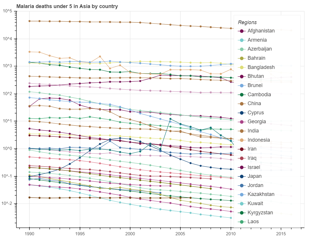
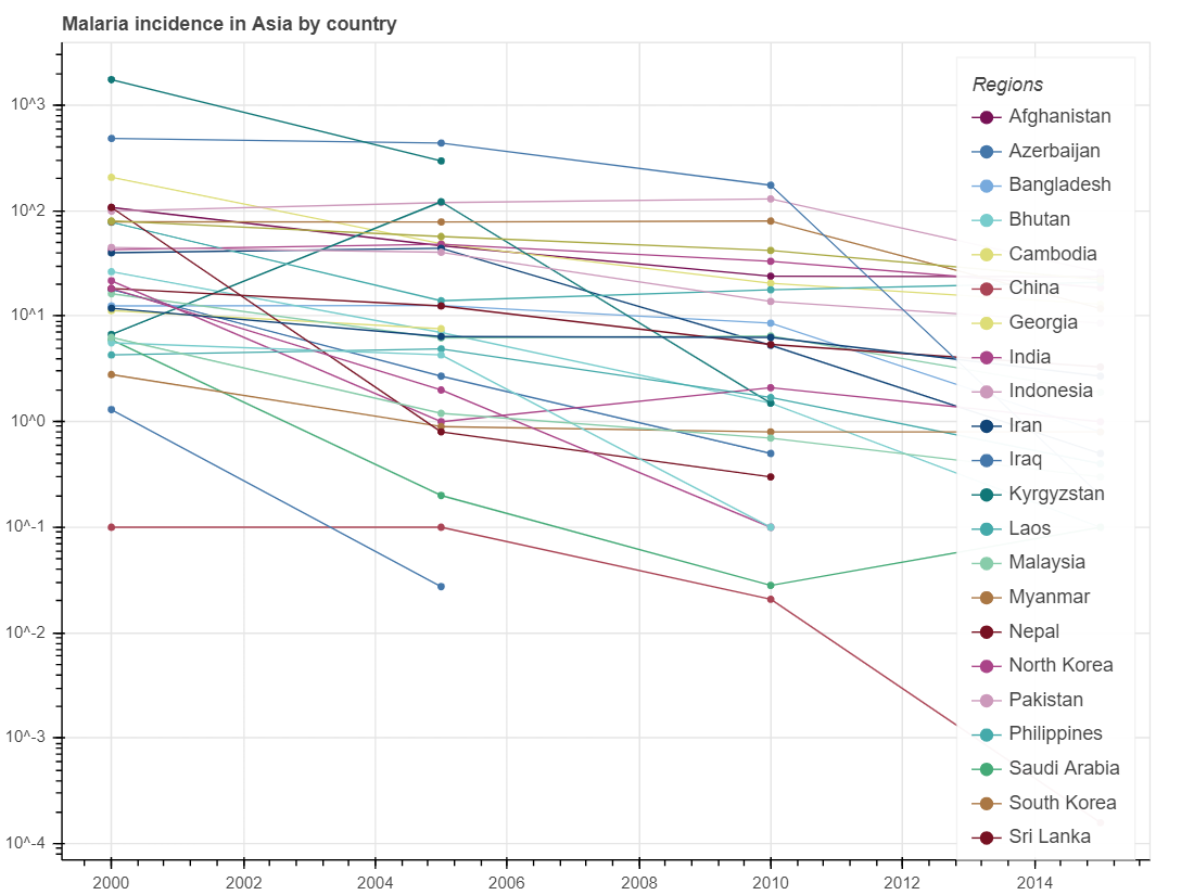
From these three figures, we can identify a trend that mortality rate of all ages, child mortality rate and incidence rates of malaria gradually decreased from 1990 to 2015. These results may indicate that health situation in Asian countries has been gradually improved since 1990.